- tag
Trends
- date
16 February 2024
If you are familiar with Knokke, Belgium, you are probably already aware of La Réserve: Belgium’s first coastal five-star hotel, owned by Belgian investors Marc Coucke and Bart Versluys and recently renovated to surpass its former glory days.
With a history dating back from 1924 and since its opening as La Réserve in 1949, the hotel has been a notable landmark of the ritzy seaside town, welcoming distinguished guests such as Marlène Dietrich, Brigitte Bardot, Frank Sinatra and René Magritte through its doors – but also contemporary celebrities such as David Beckham, Paris Hilton and Jean-Claude Van Damme.
The goal of the recent restoration is to go above and beyond the splendour of the past, making the renewed architectural beauty a paragon of hospitality.
Assigned to this mission was no one other than the prominent architect Glenn Sestig and his team, redefining quiet luxury through a unique combination of styles and quality materials.
Let us take you on a tour.
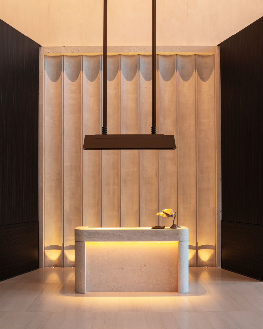
When approaching the impressive façade of the hotel, the most remarkable aspect is that, despite the monumental look, the entrance is intimate and approachable – a recurrent theme throughout the interior.
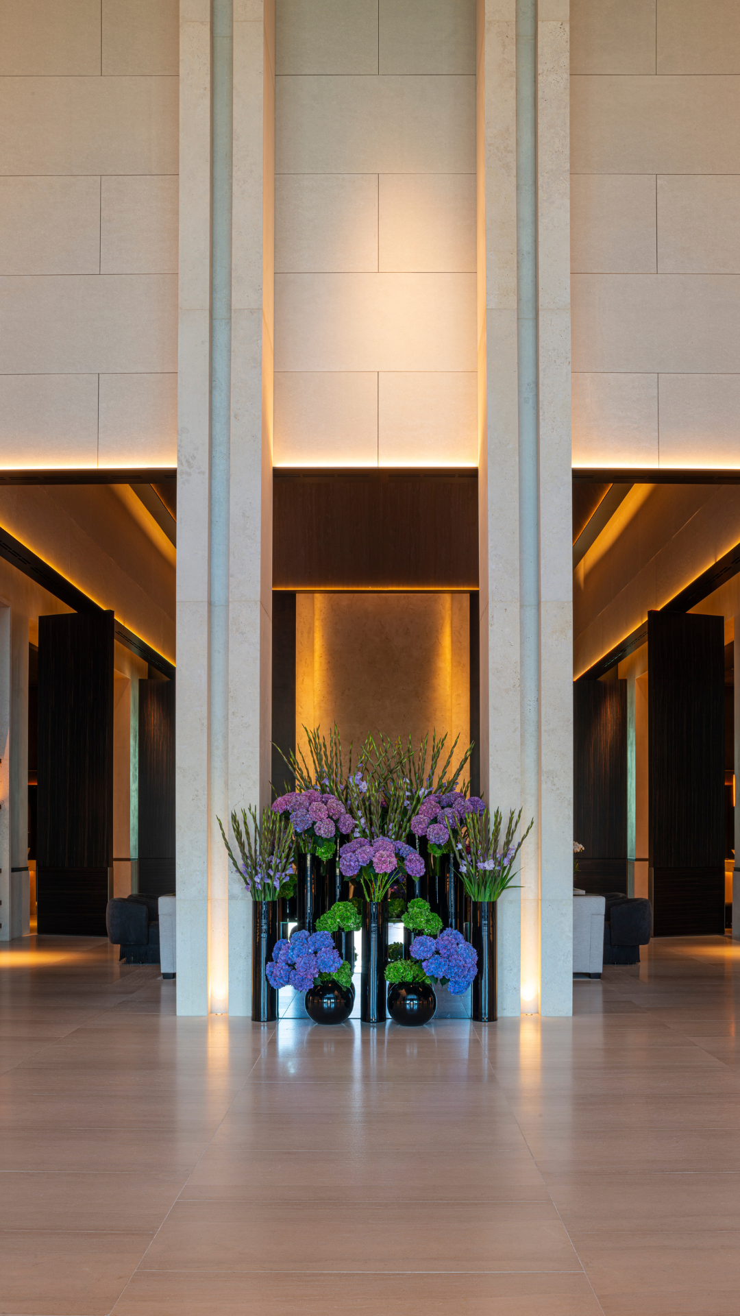
Upon entry, the formerly imposing hallway is now halved into two parts: the entrance, and the lobby area.
Despite the grandeur reflected in the height of the structure and the dark ceiling, a cosy feeling is once again infused throughout the area through lowered and indirect lighting, the rounded concierge and event counters, the artfully arrayed flower display and the use of wooden screens to create a more snug setting in a lovely, dark ebony veneer of our Infinite Wood collection.
Mr Sestig explains how the seaside was a major inspiration for the interior, which is apparent throughout the tour.
In the lobby, it’s the contrasting dark and light colours, “Light colours are inherent to the seaside, so it was an obvious choice to use this as a base. However, you run the risk of a bland interior when only using lighter tones. Contrasting darker tones brings a natural warmth and richness to an interior. After all, we’re at the Belgian seaside, so the looks also have to accommodate the gloomier winter months as well as the brighter summer months.”

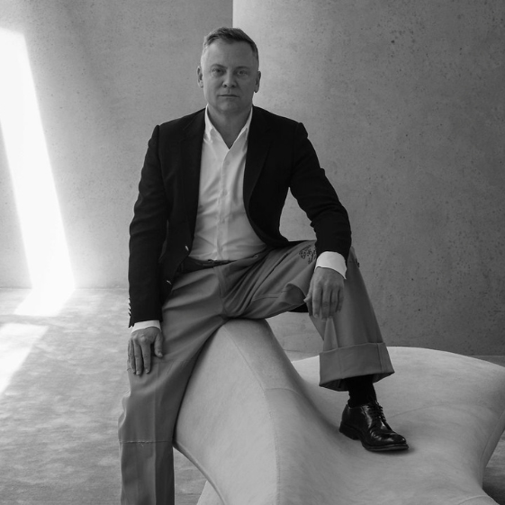
Architect
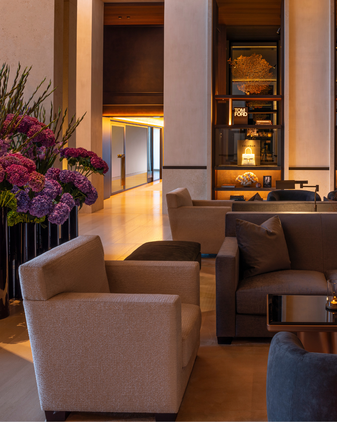
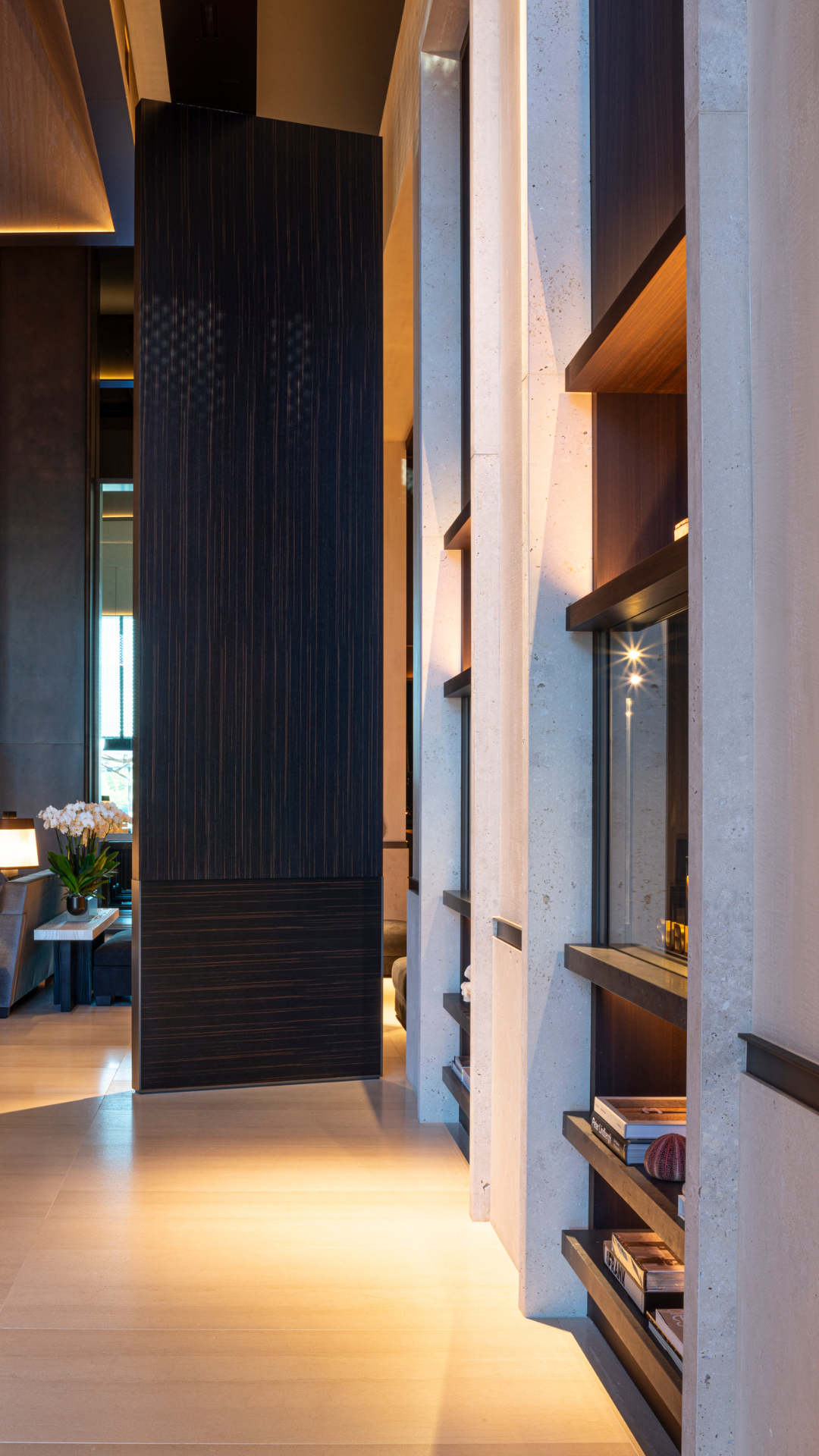
Moving on to the second part of the hallway, the lobby area, you’re greeted with a homely view of armchairs and sofas around a fireplace, surrounded by bookshelves containing luxury products and ornaments. Looking up, the ceiling is adorned with a lovely shade of gold, crisscrossing beams and slanted edges made from a lively bespoke oak wood veneer, full of character.
According to Sestig, the current ceiling was a nod to the original straw rooftop and beams of the former building, constructed in a way to break the noise and echoes of such a large space. The nostalgic theme continues from the ceiling to the furniture, which includes select pieces designed by Jean-Michel Frank, one of the founding fathers of minimalist interior design.
Sestig justifies his choices: “We wanted the hotel to become a place that people want to come to – to see things, to see furniture they specifically don’t have at home.”
Sestig elaborates on the design choices for the lobby: “The thirties were very influential for the interior design as they’re a homage to the former glory days of the hotel, what La Réserve represents. But in order to carry the design to a contemporary setting, we needed to combine old and new – otherwise known as nowstalgia.
By selecting all the best parts from previous decennia, you’re able to craft a whole new story or style with a contemporary atmosphere.”
This theme blends well with the previously-mentioned monumental style that’s present in the blockish counters, imposing ceiling lights, and straight-backed chairs. But once again, a certain softness cuts through: the counters are rounded, the lights are soft, and the details – such as the leaf-shaped desk lights – are whimsical.
The surrounding bookcases are dressed in a warm, smoked eucalyptus wood veneer elegantly juxtaposed with a light pink onyx, inviting people to grab a book and settle in by the fireplace – and enhancing the overall feeling of hygge that is ever-present.
Sestig elaborates on the wood choices: “We wanted warm tones, which makes wood an evident choice,” he explains. “You can really see the colour variations on this smoked eucalyptus. Fake doesn’t work in a setting like this. It has to be natural.”
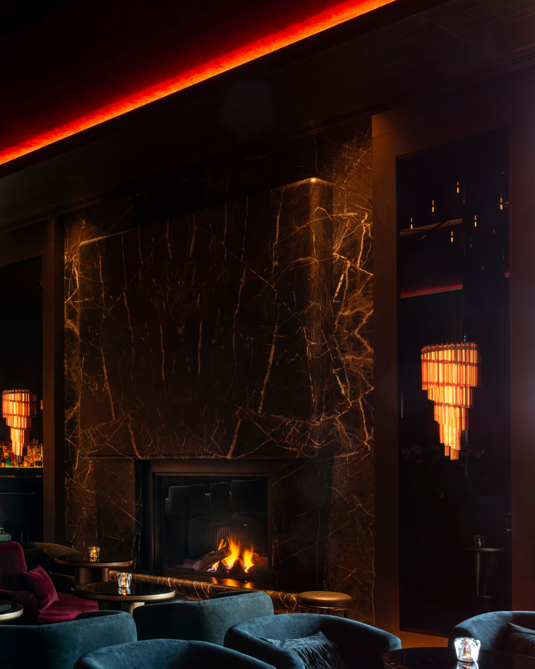
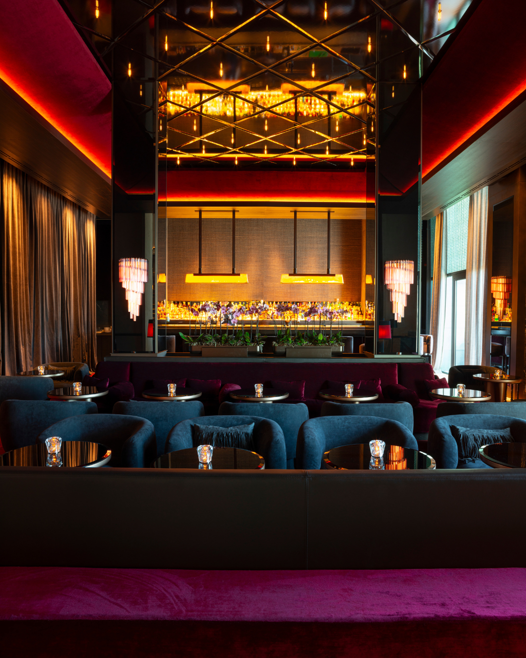
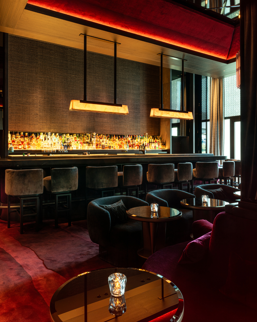
Behind the lobby lies the bar and restaurant. Stepping into the bar is a bit like stepping back in time: the look and feel of the thirties is fully dialled up through a combination of soft velvets, red undertones, marble, and an extension of the dark ebony from the lobby. Gentle lighting emanating from pink Murano glass sconces makes it a cosy and intimate setting.
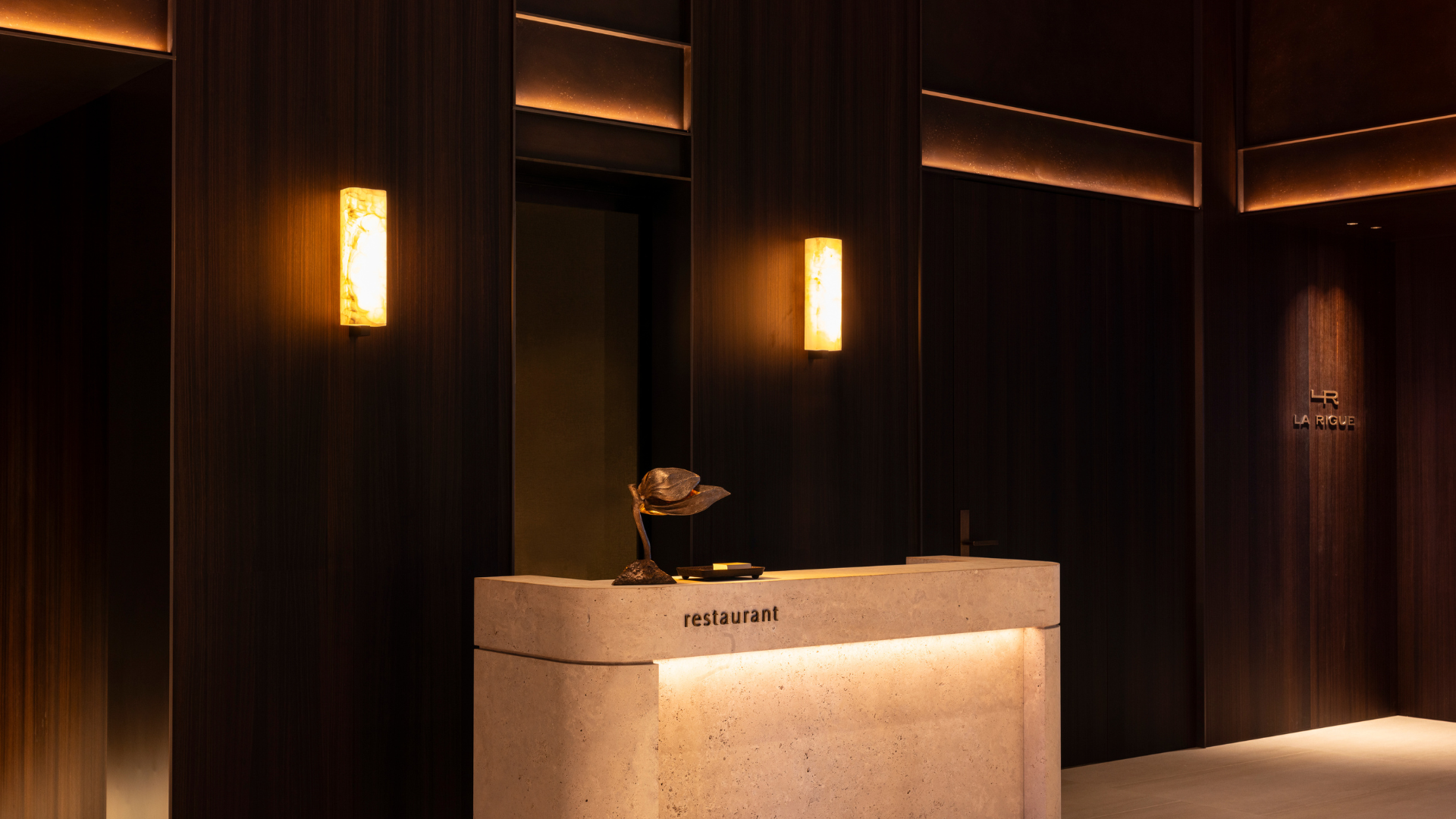
The dramatic ambience of the bar is offset by the light, airy feel of La Rigue, the hotel’s in-house restaurant. The lobby’s spectacular ceiling runs through the dining area, a warm glow bathing onto the cocooned tables.
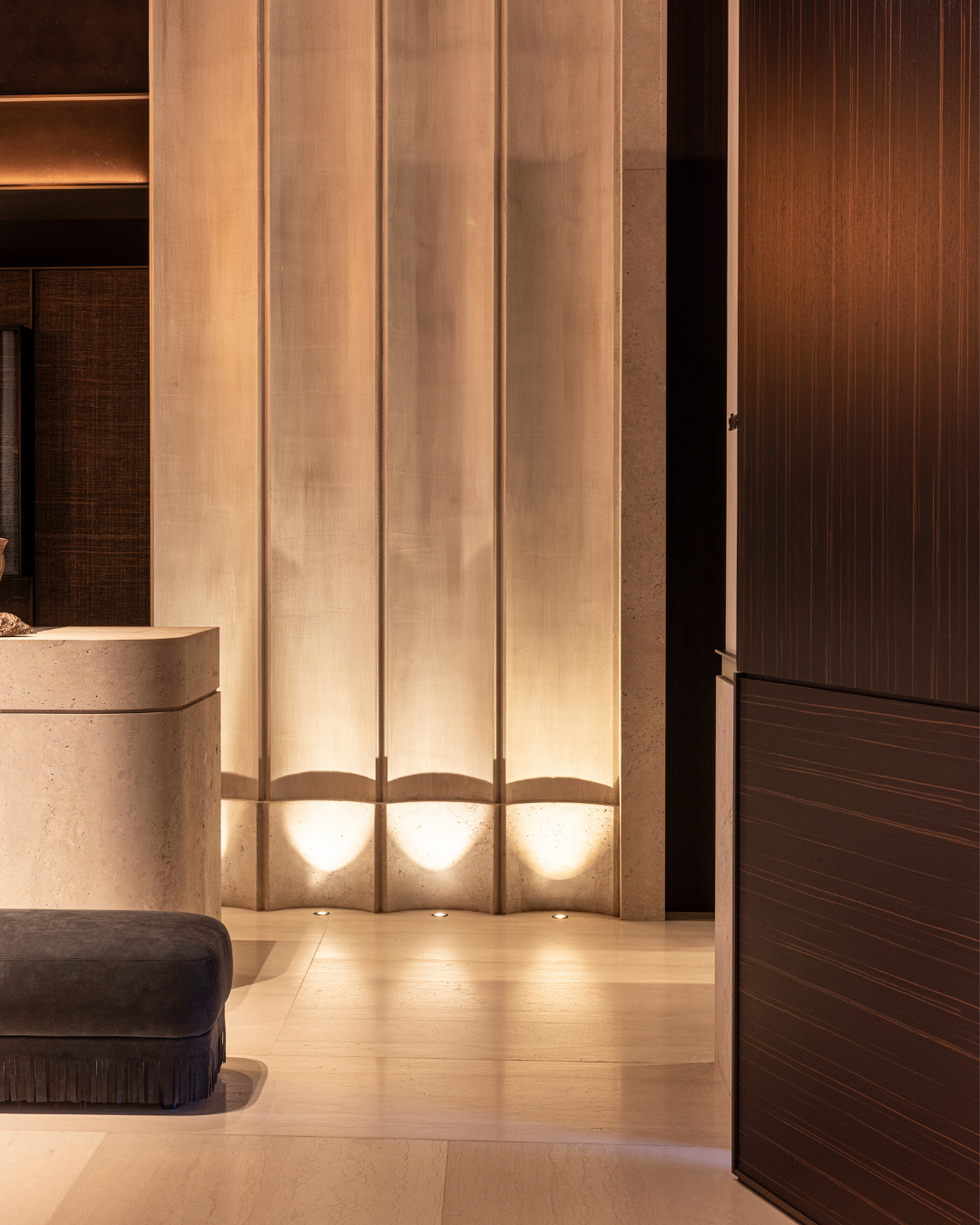
The character of the oak on the slanted edges is clearly visible here, with knots and cracks providing texture to the look. But there are more textured elements in place: a striking wall wraps around one side of the restaurant, “to imitate the ripples a wave leaves behind on the sand,” Sestig explains.
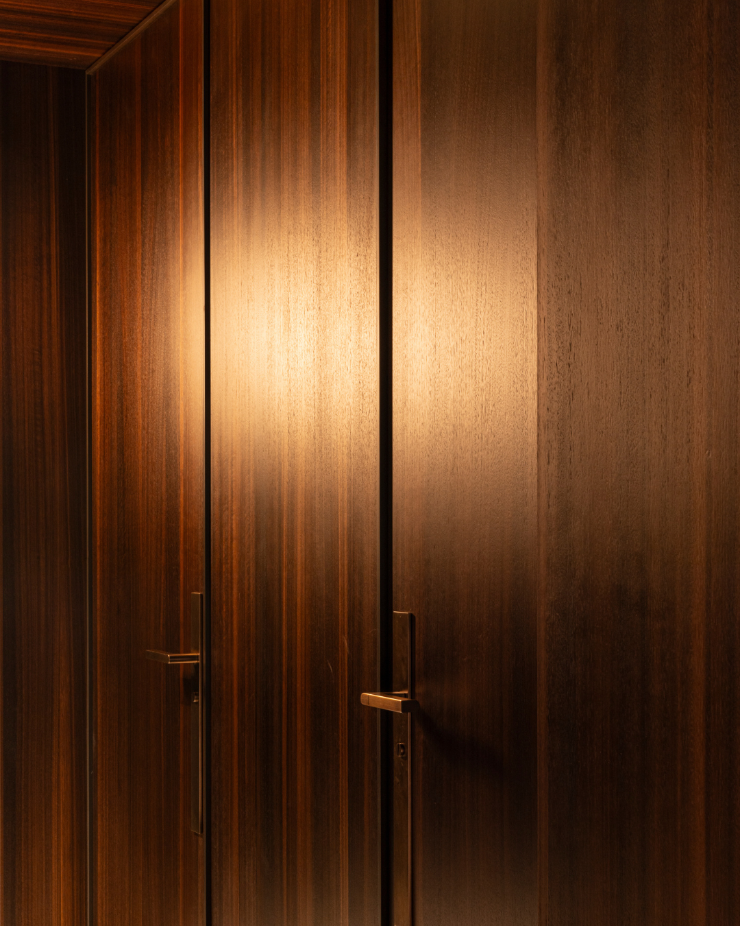
Neat cupboards along the side of the restaurant – dressed once again in Decospan’s Talitha Ebony Infinite Wood – provide a pretty yet practical backdrop for the waiters’ workstations. That practicality is another genius aspect of Sestig’s design choices. Not only do the waiters have their classy workstations, but the bellhops have their own space at the entrance of the hotel to whisk away brightly-coloured luggage that might mar the wow-effect upon entering.
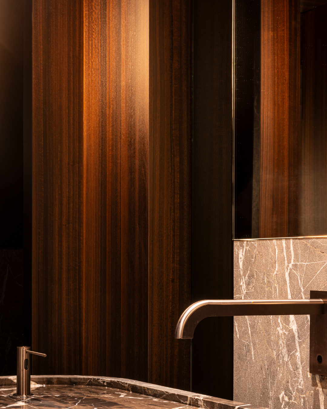
But that’s exactly the magic of the design: everything is an experience. A trip to the toilets will bring you to a hallway, fully dressed in the same warm, dark eucalyptus wood veneer – enhancing that sheltered, cocooning feeling. A subtle stone wall with the carved names of the hotel’s previous celebrity guests resides on one side of the hallway, a discrete commemoration of the hotel’s famous past.
The toilets themselves are luxuriously finished with a private lit-up onyx sink for every cubicle. The onyx is a repetitive element throughout the area and creates a wonderfully layered look paired with touches of marble, the warm wood and a black glass ceiling to create a mirror effect.
An imposing yet comfortable meeting room
The tour ends with an imposing yet comfortable meeting room, pairing the signature eucalyptus wood with pink onyx and holding its link to the seaside in the shape of a beautiful coral ornament. An impressive wine cellar takes up most of the underground floor – sober yet striking in marble and glass with wood details. There too, the toilets are dressed up in wood veneer – this time using Shinnoki Shadow Eucalyptus, Decospan’s prefinished wood panels collection.
The definition of quiet luxury
La Réserve has it all: elegance and grandeur, intimacy and softness, yet still practical and workable for the hotel staff. It honours the past glory days, but looks towards the future. It’s a collection of oxymorons, yet somehow, it works – and it does so beautifully. Glenn Sestig sums it up best: “This is the definition of quiet luxury.”
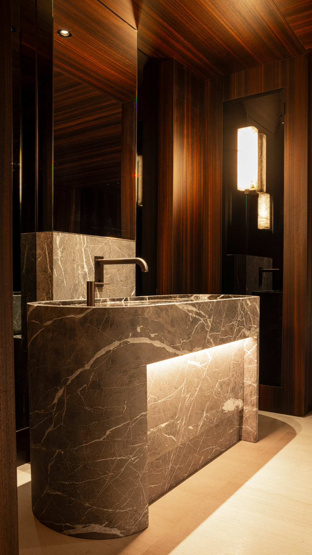
The wood veneer used for the interior of La Réserve was provided by Decospan. This was a custom project with carefully selected wood types for a bespoke look. We provide guidance for specific requests if you want to explore the possibilities for your own project.
